Responsive web design comes to York
Smartphones are everywhere. In the UK, more than half of mobile users have a smartphone and the number is growing all the time. Many people now have quick and convenient access to the web wherever they go. However, it can be a headache for website owners, who suddenly found their sites don’t work so well shrunk down onto a tiny screen.
Mobile websites
The initial response is often to build a separate mobile website to run in parallel with the full-size version. However, this can create as many problems as it solves. First there is the cost of designing, building, and maintaining two complete websites. It can also be awkward for users, who might end up on the wrong version of the site via, for example, a shared link.
Also, as more phones and browsers are released, the code has to be constantly updated so it can identify any new mobiles. And when does a big phone become a small tablet and get the full size version?
Responsive websites
Enter responsive web design. This is a relatively recent technique that makes it possible to build a single website that works on tiny phone screens, big desktop monitors, and everything in between. Put simply, a responsive website adapts its design and layout to the screen size of the device.
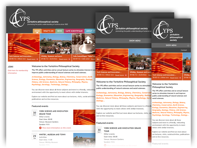
When the Yorkshire Philosophical Society asked us to build them a website that would work on smartphones, we decided to use responsive design.

Responsive design has many advantages. There is only one website, so it can be easier for users navigate, easier for owners to manage content, and easier for developers to maintain. The site is also more future-proof, as it can display correctly on any screen size, including devices we don’t know about yet. In addition responsive design uses standard web technologies so it is fully backward-compatible with older browsers—even the dreaded Internet Explorer.
It also opens up new possibilities for design. For example, sites can be wider as well as narrower, making better use of giant wide-screen monitors. This is a new technique and we are only just scratching the surface of responsive design. However, it has really taken off in the last year and is a great way of making your site work on mobiles as well as desktops. Expect more responsive sites from Castlegate IT in York soon!
You can view more examples of responsive design at Media Queries or get in touch for more information. You can also see our responsive design for Yorkshire Philosophical Society in action at www.ypsyork.org.