Carers’ Resource
Carers’ Resource is an award-winning charity that exists to support unpaid carers across Yorkshire. They provide information and advice to carers, vulnerable people, and professionals who work with carers. By working in partnership with service providers, they make practical and emotional help available to everyone, with the aim of improving the care landscape.
The brief
When they came to us Carers’ Resource had an unwieldy amount of valuable information on their website and were overdue for a complete website restructure. Committed to helping a number of distinct groups, it was vital that their content be more easily identifiable by and accessible to the specific users who could most benefit from it.
The website
Working from our established project methodology, the insight and planning phase was key to the successful design and build of the new website. We worked collaboratively with key stakeholders from each branch of the organisation to ensure that everyone’s needs were considered and met.
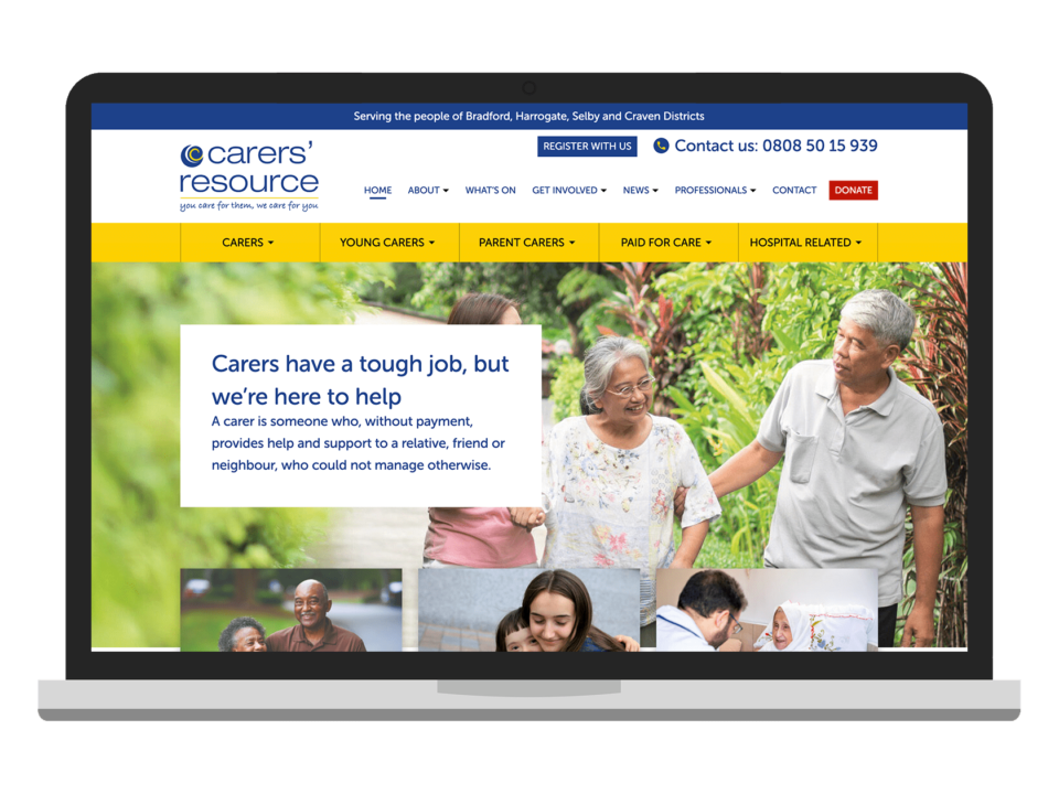
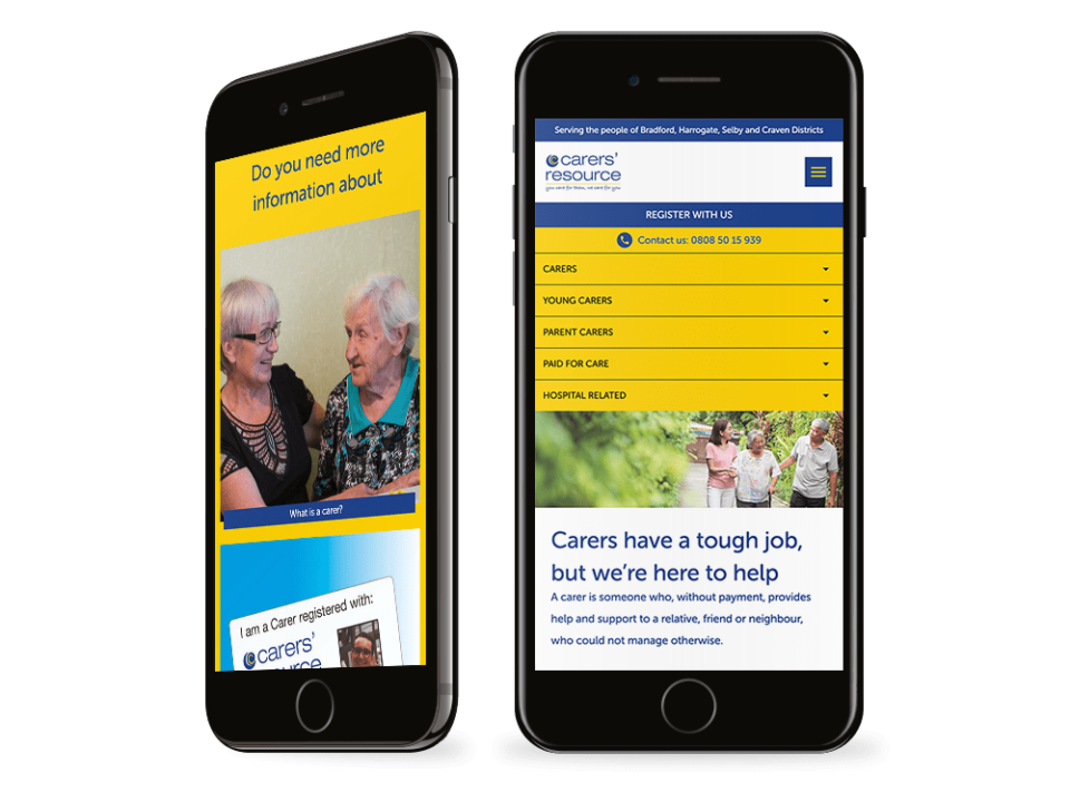
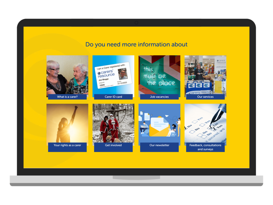
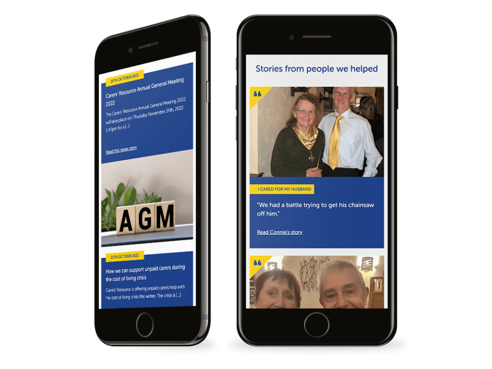
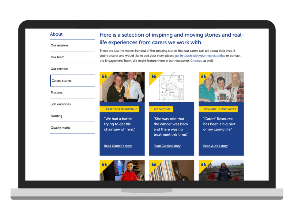
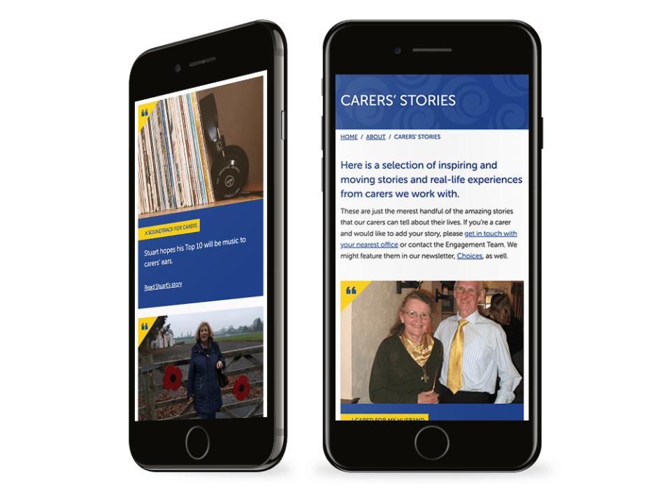
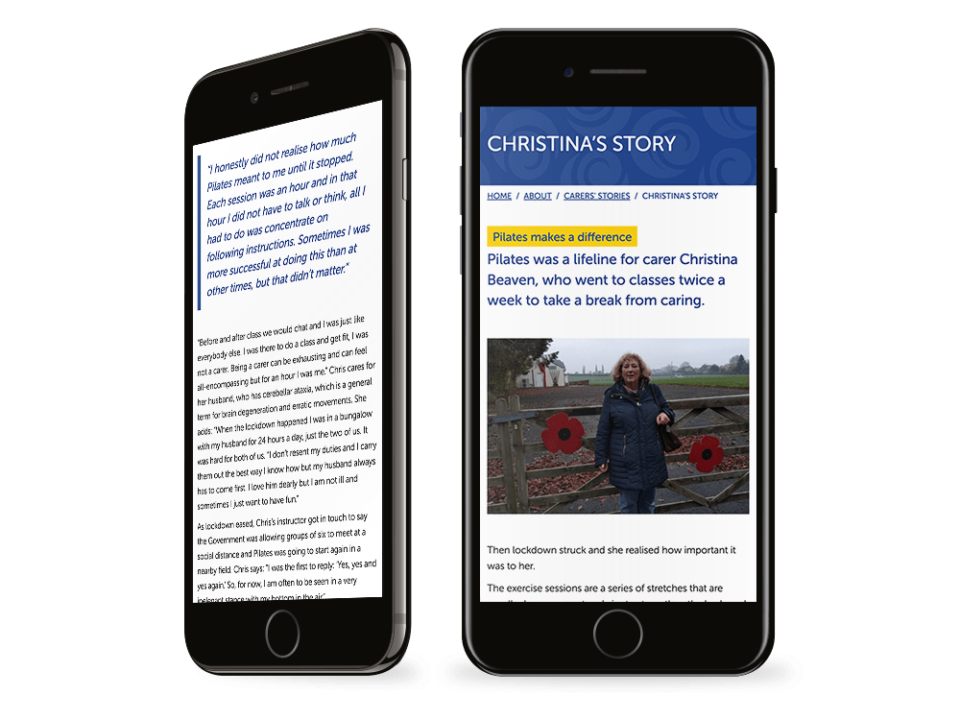
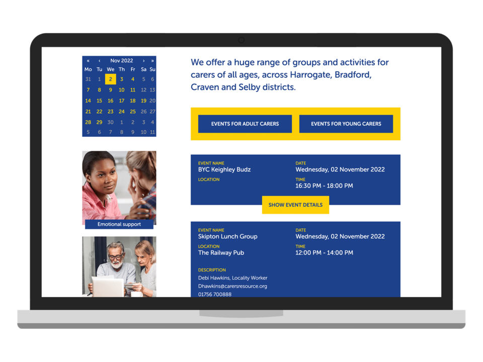
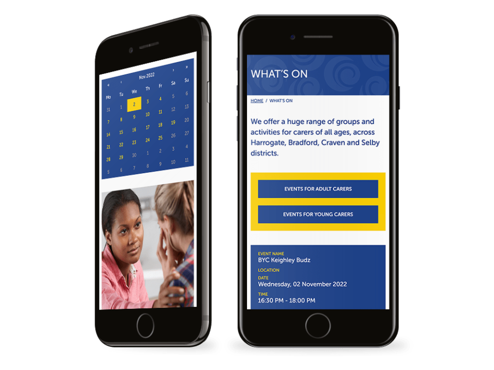
The architecture of the new website was based on the insights from those meetings. We used an intuitive split navigation system to enable adult carers, young carers, and those in need of care to quickly find targeted resources. On the homepage there is a grid of quick links to the most visited areas of the website with clear calls to action, further streamlining the users’ journey. The brand colours – blue and yellow – are used consciously to produce a clean, cohesive aesthetic.
We ensured that our design fitted with the existing platforms and processes that Carers’ Resource were using. A new syndicated events feed complete with filter function shows specific audiences only content relevant to them. We also provided seamless links to their existing selection of forms.
The result
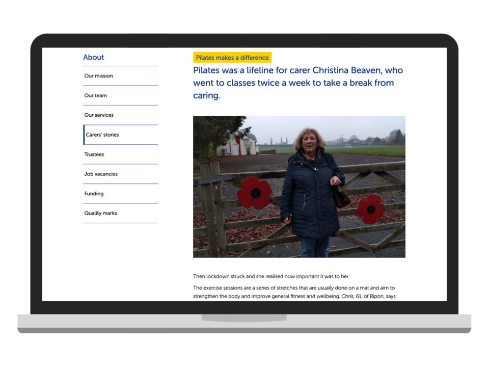
A collaborative research phase enabled us to create a uniquely accessible website which structures a vast amount of content clearly. The journey for each user group is clearly defined and natural to follow. The result is a highly functional website, with sympathetic branding subtly interwoven, that will support Carers’ Resource’s users for years to come.
See more of our websites for charities.
Visit: www.carersresource.org