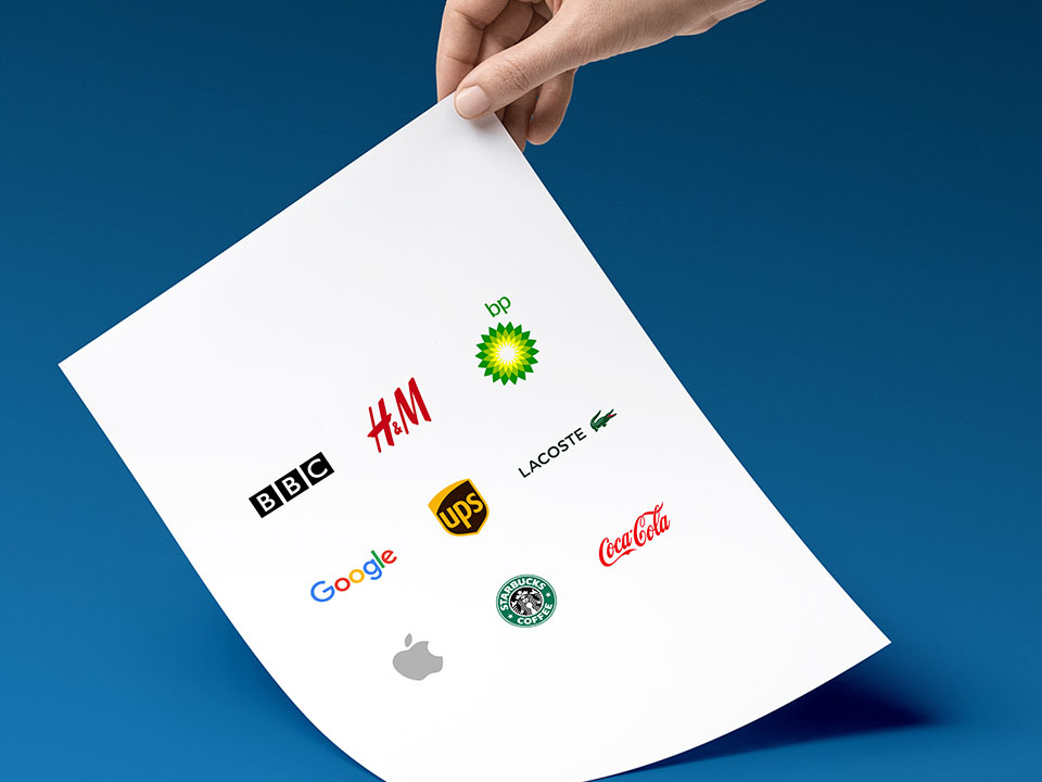
Is your logo working hard enough for you?
To answer that question you must understand the purpose of a logo and why it matters to your customers.
People think designing a logo is simple, that it is just the company name written out in a nice font. The truth is a lot more thought and consideration goes into the process of creating a strong brand identity than just selecting a nice typeface and a bright colour. A strong logo takes the essence of a brand and distils it into a concise mark or symbol. A logo should strive to be:
1. Simple
2. Memorable
3. Timeless
4. Versatile
5. Appropriate
The logo is often the first point of contact a prospective client or customer will have with your brand or organisation, therefore it needs to make the right impression. It’s also one of the first physical considerations we make when starting a new creative project.
Whether the project is for a one-man band operating locally, or a global company with an offering stretching across multiple territories, your logo needs to be an instantly recognisable mark that reflects the quality of the product(s) or service(s) you provide.
Your organisation may already have an existing logo or brand mark. In this case, it is important to consider if the logo is working hard enough for you.
Some questions you should ask include:
1. Is the logo still relevant or has our company evolved since its inception?
2. Does the logo convey our values?
3. Does the logo look professional?
4. Does the logo exist in the correct file formats to allow for various uses (i.e. digital and print design)?
5. Do guidelines exist on the logo’s usage so consistency is maintained?
If the answer to any of these questions is ‘No’, a refresh or update should be considered and we would be more than happy to assist. Please contact us by emailing info@castlegateit.co.uk or call 01904 654036.
The five different types of logo
Logos can generally be broken down into 5 main categories, and it is good to give consideration to which one would suit your organisation best at the outset of the design process. Through our research and development phase it could be that an alternate approach is required, but being aware of the basic categories, in the beginning, could help to shape the outcome and reach the project goals quicker.
The Wordmark
A Wordmark sets the company name purely in a typographic style. The typography can be based on an existing typeface or a custom bespoke typeface. Handwriting or even a signature can also be used to create a memorable Wordmark.
A Wordmark is appropriate for both new and established companies and when done correctly, can communicate a sense of purpose and stability. This type of treatment works best when the company has a distinct name that can be paired with an appropriate type treatment to create strong brand recognition.
The Lettermark
A Lettermark abbreviates the company name to its core letters. Like a Wordmark, the typography can be based on existing or custom bespoke typefaces, handwriting or a signature.
This type of treatment can be useful if your company name is long or is difficult to pronounce. If you are a new company, it could be useful to include your full company name under the Lettermark to help establish who you are. As your reputation grows, you may consider removing the full name to streamline the identity or replacing it with a strapline.
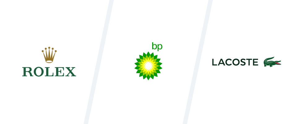
The Pictoral Icon
A Pictoral Icon, as the name suggests, uses a Pictoral Icon in isolation (no associated text) to represent the organisation.
To adopt a pure Pictoral Icon is a bold step. Your organisation must be confident that your product or service is recognisable enough that no further written information is required to communicate what your icon represents, even when it is viewed out of context (eg as an event sponsor alongside other logos). Only a few brands pull the Pictoral Icon off successfully and generally, they have reached brand maturity. They are also typically the market leader in an already established and well-recognised field.
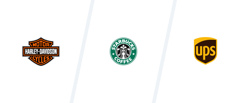
The Combination Mark
A Combination Mark looks to pair a Wordmark or Lettermark with a bespoke icon. Often the icon is abstract in form, which offers greater flexibility of interpretation and clearer brand recognition.
The Combination Mark offers an organisation flexibility because although the design elements will work in harmony, they can be separated in appropriate situations (eg the icon could be used for social media profile pictures, without the inclusion of the Wordmark).
The Emblem or Crest
An Emblem or Crest can be viewed as a type of Combination Mark, but generally has less flexibility. In an Emblem or Crest, the elements of the logo (typographic treatment and iconography) are not typically separated out or used in isolation.
Case study
![]()
The Parlington Village project is an exciting development in Leeds which aims to deliver a sustainable new community based upon Garden Village principles. They plan to provide a range of high-quality homes, including affordable housing. A primary school, healthcare facilities and shops as well as a range of employment spaces will be considered from the outset to enable a community to grow and thrive.
Before the new website could be considered, an update of the existing identity was required.
The existing logo typography was updated with a more complimentary and contemporary font pairing. The main typeface communicates the heritage of the brand with the secondary font hinting at the modernity of the project. The icon sizing was reduced slightly to give the brand mark more balance and to give more impact to the typography. The structure of the icon was also simplified with the removal of some of the internal structural lines. The removal of these internal lines aids overall clarity.
The colour palette was modified in favour of more traditional greens, again to reinforce the heritage feel of the project.
If you would like to discuss logo design with us further please contact us by emailing info@castlegateit.co.uk or call 01904 654036.