How wide is your website?
These days, almost everyone has a large, high resolution, widescreen monitor and so you might think it doesn’t matter how wide you design a website. Unfortunately, it is not quite that simple but there are ways of making more use of wider screens without causing horrible horizontal scrollbars to appear for your users.
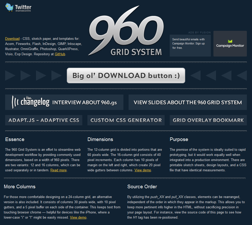
960 px: the magic number
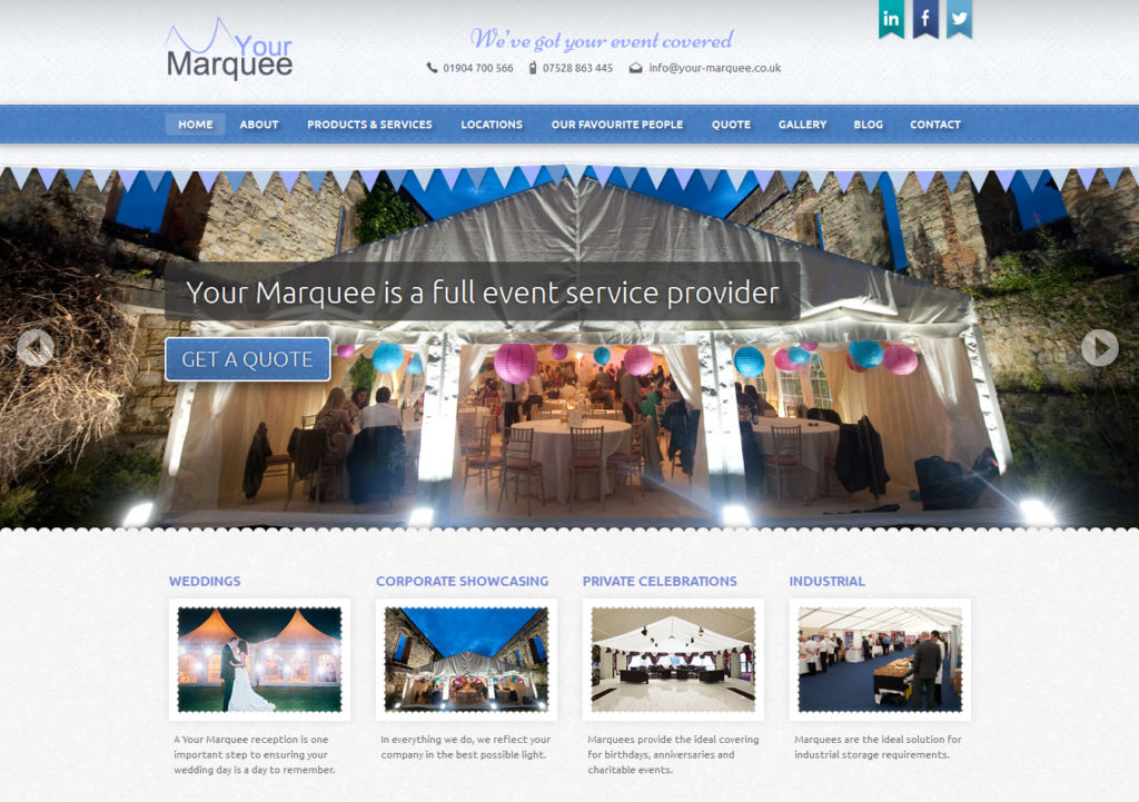
For a long time, 1024 × 768 px was the standard screen resolution. Allowing for the edges of the browser window and perhaps a scrollbar down one side, this left a realistic maximum width of 960 px for your website. Since then, typical desktop and laptop screens have got bigger and their resolution has increased dramatically. However, a small but significant proportion of web users are still using 1024 × 768 px screens and we cannot just ignore them.
While screens have been getting bigger on the desktop, they have also been getting smaller elsewhere. Smartphones have small screens and an enormous range of resolutions, but because 960 px websites have become so common, most mobile browsers automatically zoom out to show around 960 px when viewing a fixed width website. Therefore, 960 px is a good choice for mobile browsers too.
How can I make my website look wider?
Making the content of your website fit within 960 px doesn’t mean you can’t still make the most of wider screen resolutions. It is quite simple to add bars of colour or large background images that extend beyond the 960 px content area. You can also add padding around the content, giving the impression of a wider site. In all these cases, the parts of the site outside the 960 px area containing the content will be hidden on small screen sizes.
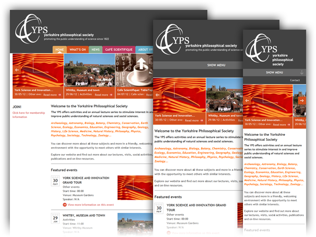
Responsive websites can be any width
The proliferation of screen sizes and resolutions means that a fixed width website will always be a compromise, displaying correctly on everything but not always looking like it belongs on anything in particular. With responsive web design, a website can can adapt to fit any screen width. This is often used to make websites that fit neatly on mobile phones. However, the technique can also be used to create sites that adapt to wider screens. Smashing Magazing is a great example of a site that adapts to both wide and narrow screens using responsive design.
The 960 px rule will be around for some time to come. There are ways to make websites look wider, while still using a fixed width and keeping the content inside the viewport. But to make best use of all screen sizes, big and small, there is no better way than responsive design.