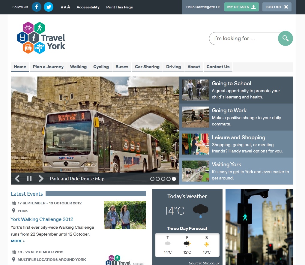
i-Travel York: a smart site for intelligent travel
Back in 2010 we built the City of York Council a website to support and showcase their Cycling City York project. This week the Council unveiled its next step: i-Travel York. We’re proud to be able to claim responsibility for the accompanying website again.
i-Travel York (short for Intelligent Travel York) builds on the previous project but incorporates all travel modes, helping people to switch to more sustainable transport. And when I say ‘all travel modes’, I mean it: there is content on everything from mobility scooters to taking taxis to electric cars to nordic walking.
It’s a huge site, and it’s only going to get bigger and more useful as more parts of the project are completed.
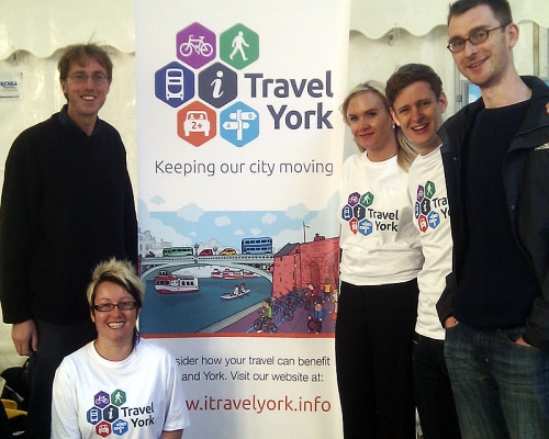
The design of the site was by Diva* Creative, a Sheffield based company who are handling the promotion of the whole project – including the launch events (pictured). They also made this video – well worth a watch if you want to know more about the project:
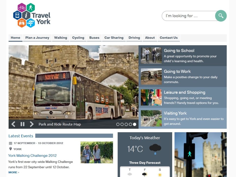
One thing that was clear from the beginning is that this would be a website for people on the move – and that means a responsive design that will work on any device: tablet, laptop or mobile phone. This is becoming a speciality of ours and we’re particularly pleased with this one.
It’s a big site, with lots of interactive elements, complex content, images, maps, and a slideshow in the banner on the home page. Making these things responsive – as well as attractive – was a technical challenge for us and a design challenge for Diva. We worked together closely to make sure the site was looked good and worked well across the full range of computers, tablets, and phones.
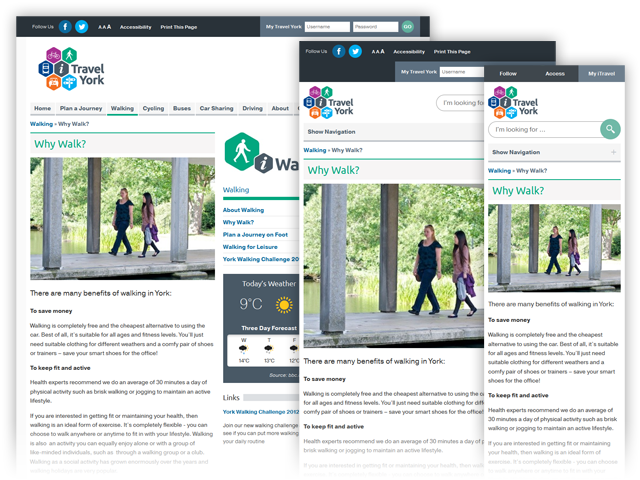
Responsive design has a lot of benefits. By keeping all the content in one site, it is easier to manage and easier to share links. It is also future proof and the nature of the design makes it naturally accessible. Thanks to some great designs, we think this is a really good example of a responsive website.
As with the Cycling City site, we used the ultra-flexible ExpressionEngine CMS to provide the backbone of the system. EE is a good system, but really comes into its own when it’s loaded up with plugins that allow a huge amount of flexibility. There’s a huge library of downloads and images behind the scenes that has to be managed, and lots of bespoke coding. Carried over from the Cycling City site we have our familiar weather forecast widget, a protected area for schools to record surveys of bike usage, and the familiar per-page image galleries. We also have the same high standards of accessibility on the new site.
Some of the new facilities on this site, then: We have fully responsive embeddable Google Maps – which requires some ingenious tomfoolery – and our own aggregated Twitter feed widget. There’s also My Travel York, a membership system which you can sign up for. This creates an account on the website which synchronises with Campaign Monitor – our mailing list management system of choice. This will (soon) allow you to get updates specific to your areas of interest: roadworks, cycle routes, events, and so on.
There’s lots more clever stuff to be revealed over the coming months – keep tuned to the site or @itravelyork on Twitter (or indeed, @castlegateit) for the announcements.