Home / Blog / Category / Castlegate IT News
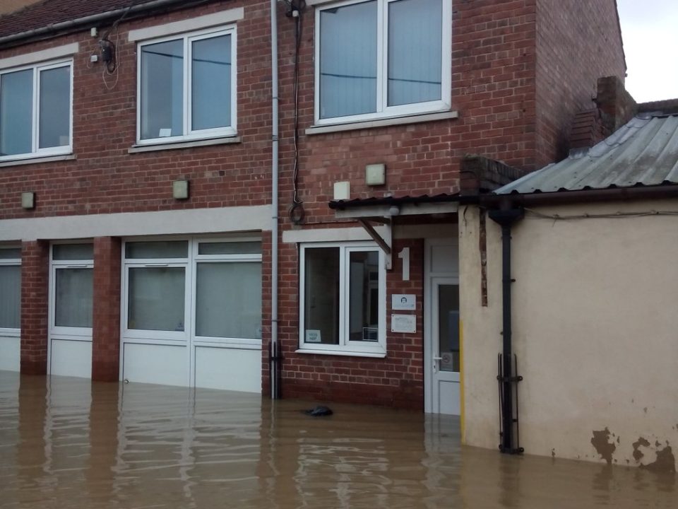
Castlegate IT’s offices are located on Walmgate, so the nomination and subsequent win for York Flood Appeal is no surprise. We’ve seen first hand the devastating impact to York and its community.
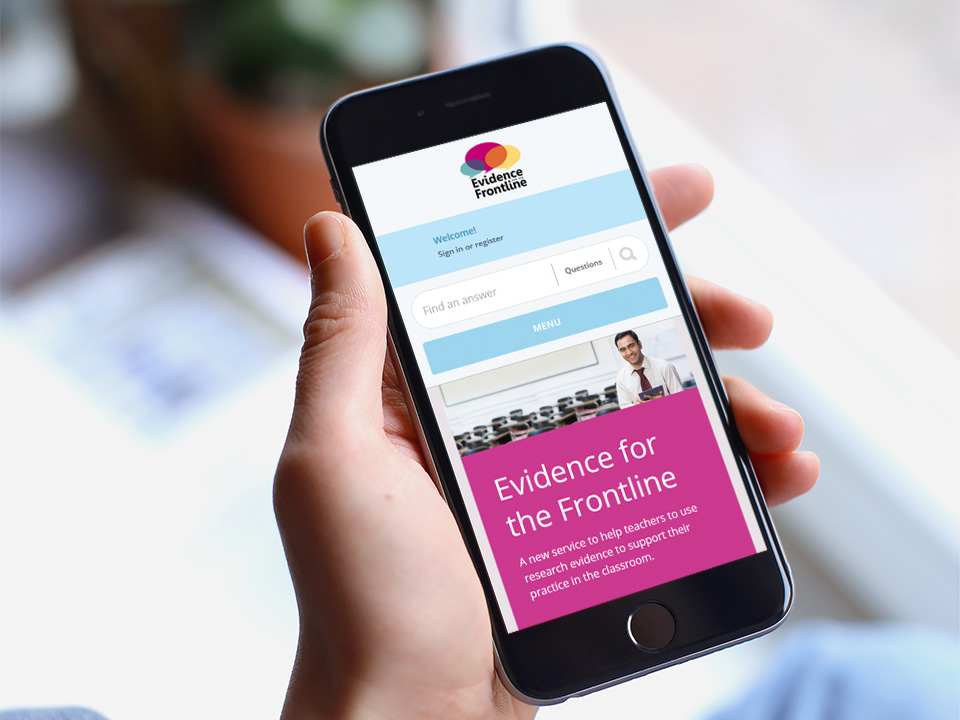
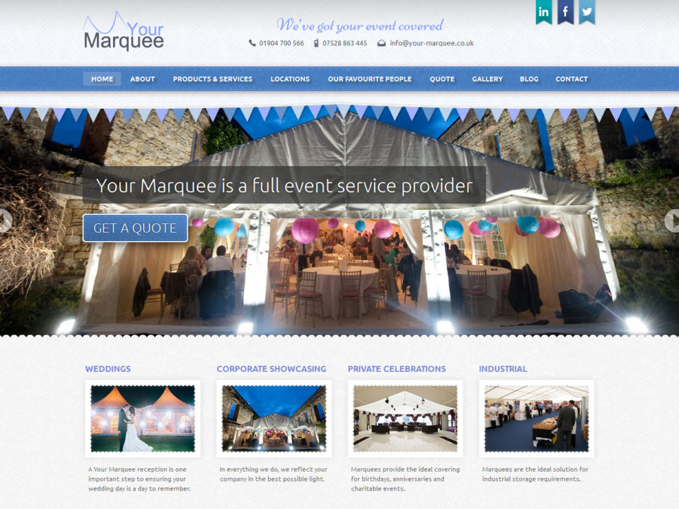
2015 has been an important year for Castlegate IT. We have taken on new staff, moved to a new office, and added an impressive range of projects to our portfolio. Our clients now include local government, museums, national education organisations, and numerous businesses from around York and beyond. With so many sites going live, we can’t possibly feature them all, but here are a few highlights from this year.
Smartphones and tablets are now the primary means of accessing the internet. They are inexpensive, easy to use, and they are always to hand. Making your website work well on mobile has become a necessity.
Anyone who’s come in to see us in the last year will probably notice that things were getting a little …cosy. So we’ve made the move to a new office. We’re out of the basement that’s functioned as our subterranean nest whilst we’ve been growing, and we’re up in a new, sunlight-filled first-floor office on Walmgate.
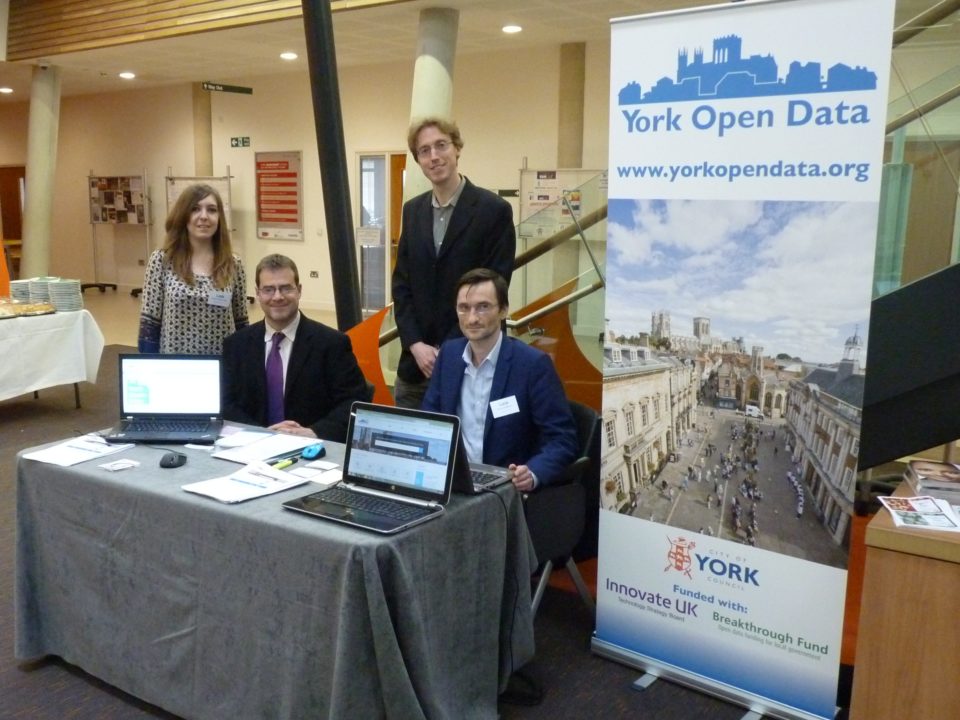
Over the past few months we’ve been working with the City of York Council Business Intelligence Hub on a new Open Data platform for York. This website will act as a repository for publicly available data on almost any aspect of life in York. Initially the data is being supplied by the Council’s own internal business systems, but other public-sector organisations will be coming on board. The system could become the clearinghouse for anyone in York who wants to open their datasets to the public.
We demonstrate some of the essential features and qualities of an industry standard e-commerce website, using recent Castlegate IT projects as case studies.
Examples from our portfolio demonstrate some of the ways in which Castlegate IT has used WordPress development to enhance websites or design them from scratch.
It’s easy to make a great blog with WordPress, but how can the platform be used to make a competitive, professional website?
We asked local journalist Pete Wise to investigate the impact of mobile devices on e-commerce over Christmas Day 2013. Are buying habits changing, what’s the long term trend and with more consumers shopping online with mobile devices, what should websites be doing differently?
In the UK, more than half of mobile users now have a smartphone and the number is growing all the time. Mobile websites have become common, but they can be expensive and more complex to manage. Responsive web design is a new technique that makes it possible to build a single site that adapts dynamically to different screen sizes, from tiny mobiles to giant desktop monitors. You can expect to see more responsive sites—especially from Castlegate IT!